Angela here and today I'd like to share with you a new scrapbook page full of tiny hidden details. This layout was created with Sweet Clementine collection which I absolutely adore because of its bright and warm colors, lots of flowers and butterflies!
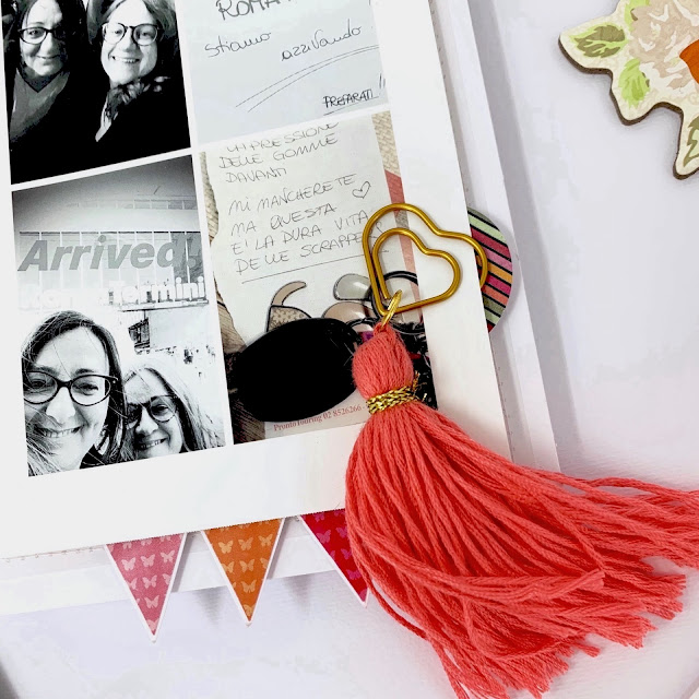
I decided to make a page about my last trip to Rome with my lovely scrappy friends. The photo is a collage of four that I printed with my Selfie. These pics are some of the most hilarious moments, before and after the departure. We had so much fun!
I started the page ripping a white cardstock and overlapping it to the reddish Sweet Clementine paper. This page is about a girl weekend away and I wanted to give it a girly twist. So, I curled a white stripe of crepe paper and I sewed it underneath the white cardstock. A also layered some flowers and a scallop die-cut and sewed them together underneath the crepe paper.
For the title I used the pink chipboard stickers from the same Sweet Clementine collection. They are beautiful and shiny because they have a pink foil detail in the centre. As I said at the beginning of the post, the page has lots of hidden details. In fact, the photo is not glued on to the page but can move. It is kept in place with a butterfly brad where I sticked a foiled chipboard heart on top.
Underneath the photo I placed the journaling. I created this part of the layout separately from the scrapbook page and only when it was finished I glued it in place.
To easily grab and move the photo, I created a tassel with some thread. I attached the tassel on a paper-clip and fastened it to the paper-clip on one side of the photo.
I love the detail of the banner stickers peaking out of the photo. What I did here is I turned the stickers to die-cuts. I sticked the stickers on a piece of paper and fussy cut around them. This way they stay flat without sticking to the page.
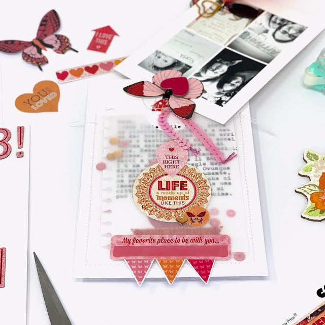
To hold the card of my journaling, I created a pocket. I used white cardstock and vellum on top. I sewed them together, leaving the top side open. Then, I started embellishing it. I wanted to focus also on this part of the layout and not only on the photo, because the journaling is a fun story and I didn't want to leave it 'naked'.
So, I created a layer of stickers to decorate the pocket. Stickers are perfect in this case. Here there isn't much space and I need everything to stay as flat as possible. I used the 12 inch Combo Stickers from the Sweet Clementine collection that holds a variety of shapes, decorative stripes and phrases.
The journaling is an interactive element of the layout. The photo rotates around the brad and the journaling card slides out from the top of the pocket.
Sequins remind me to parties and our weekend away has been a beautiful two days party. So, I filled in the pocket with pink and gold sequins, just for fun.
Other stickers and sequins decorate the Journaling card that I wrote it with my old typewriter. You can guess that it's old because of the letter prints that are not clean. To grab the card and pull it out of the pocket, I used two half circle stickers and I stitched them together with a sequins ribbon on top of the card.
Love,
Angela
BoBunny supplies:
Patterned Papers: 12" Sweet Clementine
Combo Stickers: Sweet Clementine
Chipboard Stickers: Sweet Clementine
Noteworthy: Sweet Clementine
BoBunny Gesso: White
Thickers: AC Sweet Clementine
Other Supplies:
AC white cardstock
AC Sticky Thumb Adhesives


Love this layout! That bold red is gorgeous, and so are all the elements you added to tone it down. And I just love the use of the brad and the pocket to showcase the photos and journaling.
ReplyDelete