
It's time for another Friday Challenge!! It is always such fun to see what each of you do with the challenges here at Bo Bunny!
This time the challenge is to use an ad from a magazine, the internet or any other place you see an advertisement that inspires you!
Of course, some of the design team took the challenge, too! Let's take a peek!
Tomoko Takahashi
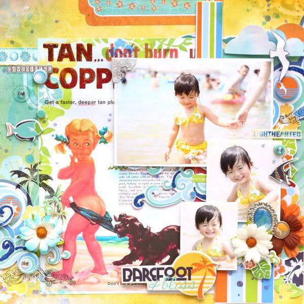
Barefoot and Bliss
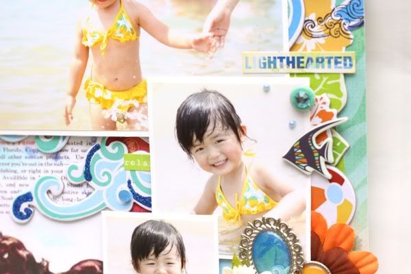
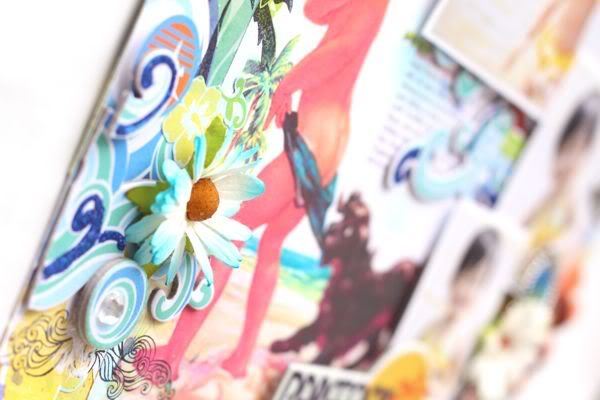
Tomoko used the brand new collection Barefoot and Bliss for her layout. Instead of using the advertisement only for inspiration, she included it in her layout! These sweet pictures go perfectly with the advertisement, too!
Supplies Used:
Barefoot & Bliss Collection Barefoot & Bliss, Beach Bag, Dot, Splash, Words, Cut Outs, 12" Sticker, Trinkets, Layered Chipboard, Dimensional Stickers, Chipboard, CS Sticker, Noteworthy Clear Stamp, Brads, Chunky Charms (Clear)
Other Supplies:
Sunscreen Ad, Acrylic Paint, Glitter, Glossy Accent, Distress Ink, Flowers, Metal Accent (Tim Holtz)
Next up:
Luzma Bruna
What a Strong Boy
Luzma also included her advertisement in her layout, added adorable pictures and used the Barefoot and Bliss Collection! Another adorable take on the challenge, for sure!


Supplies Used:
Barefoot & Bliss Collection Barefoot & Bliss, Layered Chipboard, Dimensional Stickers, Chipboard, CS Sticker, Noteworthy, Jewels,Buttons,combo stickers.
Other supplies
Distress crackle paint,glossy accents,Aqua stickles,Sakura pigma pen,Swiss dot Bazzill paper
Other supplies
Distress crackle paint,glossy accents,Aqua stickles,Sakura pigma pen,Swiss dot Bazzill paper
And Now...
Patti Milazzo
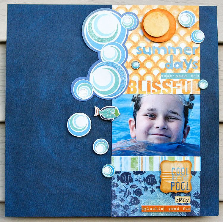
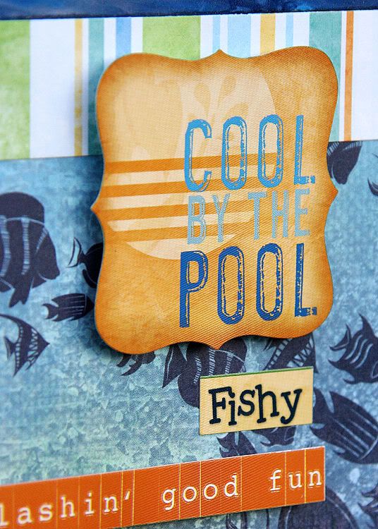
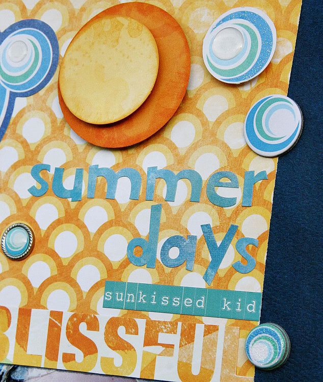
Cool By the Pool
Patti also chose to use the Barefoot and Bliss Collection! She was inspired by an Arm & Hammer advertisement in an issue of Martha Stewart’s Living Magazine. Patti's layouts aren’t typically graphic and tend to be more fussy but this ad really caught her eye with it’s simple design and bold colors that happen to match Barefoot & Bliss’s color scheme. It's Perfect!
Here is the advertisement that Patti used as her inspiration:
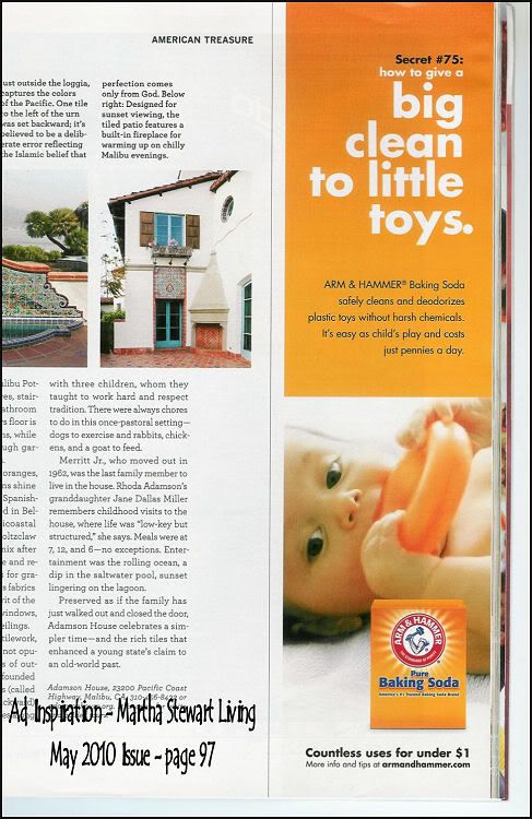
Designer Note: I used the ad’s thin column design as my focus on the page and left the remainder of the blue cardstock as “white space”. I also tried to align the word accents (alpha letters, stickers and cut paper) in a similar fashion. The “bubbles” from the Noteworthy accents as well as stickers and chipboard gives the page a bit more movement and dimension.
Supplies Used:
Supplies Used:
Barefoot & Bliss Pattern Papers – Dot, Snorkel, Laid Back, Stripe and Word, Barefoot & Bliss Combo Stickers, Barefoot & Bliss Cardstock Stickers – Backyard Bliss, Barefoot & Bliss Layered Chipboard
Barefoot & Bliss Noteworthy, Barefoot & Bliss Brads, Double Dot Cardstock – Dark Denim
Barefoot & Bliss Noteworthy, Barefoot & Bliss Brads, Double Dot Cardstock – Dark Denim
And last, but certainly not least we have:
Samanatha Wright
Howzat!
Samantha used the Ad Lib Collection for her layout! Her inspiration came from a cover advertisement. This super fun layout is such a cute way to share lots of pictures! The blocking allows for lots more options, too!

Here is the advertisement that Samantha used for her inspiration:

Designer tip: The ad is rectangular, but the blocks appealed to me so I turned the ad on it's side and used a 5x5 block.
Supplies Used:
Ad Lib 6x6 paper pad, Ad lib Dimensional stickers, Ad lib combo stickers, Ocean dot, Kiwi dot
Now it's your turn! We can't wait to see what you come up with! Be sure to link your layout here by July 6th. We will choose a random winner to win a great Bo Bunny prize!
And we can't forget the winner of the last challenge!
The winner is Celeste Brodnick!
Congratulations Celeste!
The winner is Celeste Brodnick!
Congratulations Celeste!
Please email us at thebobunnyblog@gmail.com to claim your prize!
Have a wonderful weekend!!

What a fantastic display of inspiration DT members. Phenomenal interpretations from the inspirational ads on your gorgeous Layouts!
ReplyDelete:O)
Jessica
Are there sketches that go with these layout challenges?
ReplyDeleteCongrats Celeste!,
ReplyDeleteCongrats Celeste!!!
ReplyDeleteWonderful takes on the challenge by the designers!!!
What a GREAT CHALLENGE!! I Loveeeeeeeeeee it!!! I love love love everyone's take on it! :):):):):):):):):):):):):)
ReplyDeleteThanks so much for picking me as the winner!!
ReplyDeleteBeautiful!
ReplyDeleteOhhh! I loved this challenge....fun!!...and loved the layouts inspired by the ads!!
ReplyDeleteCongrats to Celeste too!...your l/o is GORGEOUS!!!!!!!!!!! xx
Fun, Fun, Fun! Now I need to get some more BoBunny supplies (LOL)...Thanks for a fun challenge!
ReplyDeletei've just linked mine ! thanks for the inspiration !
ReplyDeletehugs from France